This ‘How to’ helps you tell the story about what you and your clients are achieving. You can be doing amazing things but if you can’t effectively communicate the results of your work, no one will know about your achievements.
This ‘How to’ assumes you have collected information using a ratings scale (refer to How to create and use rating scales) and that now you want to tell stakeholders the results in a way that they quickly understand.
Be clear about what information you are using
Be consistent and clear about what information you are presenting. You will have both raw numbers (for example, the total number of people using a service) and percentages or proportions (the fraction of the total number that is being represented). So, for example, if 90 people use a service and 45 people are satisfied, this means that 50% of the clients are satisfied.
Decide how much detail you want to present to your stakeholders
It is recommended that your scales ask people to choose between 5 or 7 options. This gives enough choice to allow people to find options which fit for them without overwhelming them. However, once you have collected all the responses you can cluster them:
- all the “good” and “very goods” become “positive” or “good/very good‘
- all the “bad” and “very bads” become “negative” or “bad/very bad“.
- The “neutral”, “don’t knows” or skipped questions can become “neutral”.
This means that your information goes from looking like this:
| Q. How satisfied were you with the service you received? | Very dissatisfied | Dissatisfied | Neither satisfied nor dissatisfied | Satisfied | Very satisfied | Not sure / not applicable |
|---|---|---|---|---|---|---|
| % of clients | 3 | 4 | 7 | 30 | 49 | 7 |
To looking like this once it’s been clustered:
| Client satisfaction with the service | Dissatisfied (negative) | Neutral | Satisfied positive) |
|---|---|---|---|
| % of clients | 7 | 14 | 79 |
Decide how you are going to show your information: tables or charts?
Tables and charts are good ways of presenting your information graphically (that is, as pictures). Presenting your information like this can help people understand it and allow you to communicate the important lessons you want people to take from it.
Should you use a table or a chart? Statisticians say that tables are for the trees, graphs are for the forest. What they mean is that tables show exact values whereas graphs show patterns, shapes and trends.
Let’s imagine that what you want to describe is quite simple, like the above example of percentage of clients satisfied with your service. This table is quite easy to understand.
| Client satisfaction with the service | Dissatisfied (negative) | Neutral | Satisfied positive) |
|---|---|---|---|
| % of clients | 7 | 14 | 79 |
But look at the table below. This is from a fictional North West Coast service (The Emu Bay Centre) which offers Home and Community Care, disability respite services, mental health services and family support services. The table gives the exact figures for clients outcomes against the programs being offered, and what the clients are reporting about their satisfaction, or otherwise, with the services. It’s a lot of information.
The Emu Bay Centre Immediate Client Outcome Evaluation Results
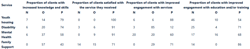
Legend
N=Negative
O=Neutral
P= Positive
For many people this information is difficult to understand – there are just too many numbers. And let’s remember that funders are busy people too – we need to communicate with them effectively.
Below are a couple of ways of presenting this information in charts which helps you to tell the story of your service. There are different types of charts to consider.
Bar Charts
Bar charts great for presenting simple information. They present two or more sets of information. You might use a bar chart to show the answer to a question like:
Chart 1: How many clients are using Emu Bay programs?
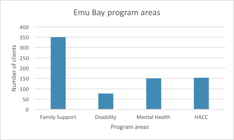
This graph shows that 350 people use the family support program, about 75 people use the disability program, and about 150 use the mental health and the HACC program.
Grouped bar chart
A grouped bar chart (also called clustered bar chart) is good for presenting information from your ratings scales.
Chart 2: What percentage of our clients are satisfied with our programs?
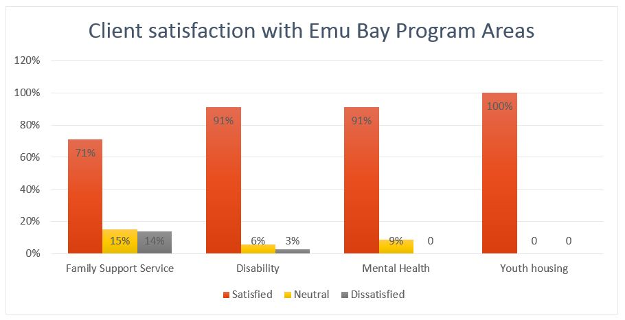
Unlike the previous table, this graph only tells you one thing – the percentage of clients in each program who are satisfied or not with a particular program. But it tells its story much more quickly than the table. It’s easy to see that the bulk of Emu Bay’s clients are satisfied with the services they receive.
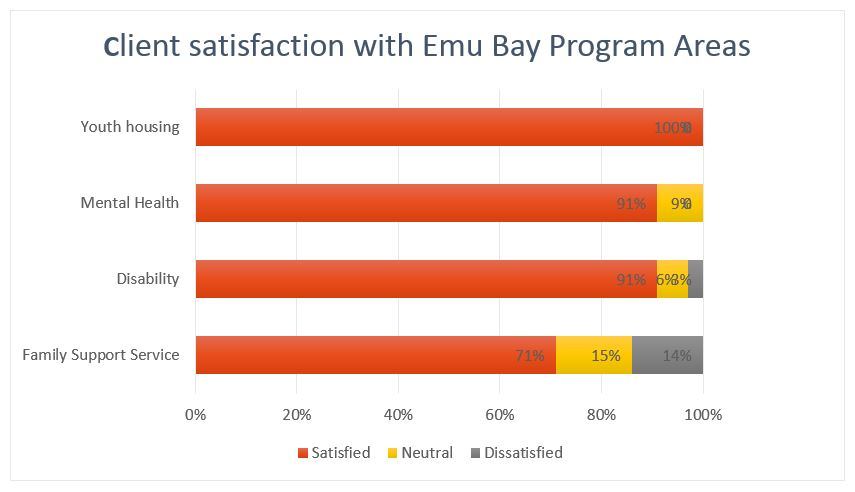
Stacked bar charts
Stacked bar charts are one of the recommended ways of presenting your ratings scale results. Research tells us that for people trained to read from left to right, stacked bar graphs presented as rows are easier to read. They look like this:
Chart 3: What percentage of our clients are satisfied with our programs?
If you want to present more complex information in charts
Before you think about presenting more complex information in graphs remember that the best way to communicate is to keep things simple. Think again about the story you want to tell. In the section on tables you saw all the data being gathered by the fictional Emu Bay Centre.
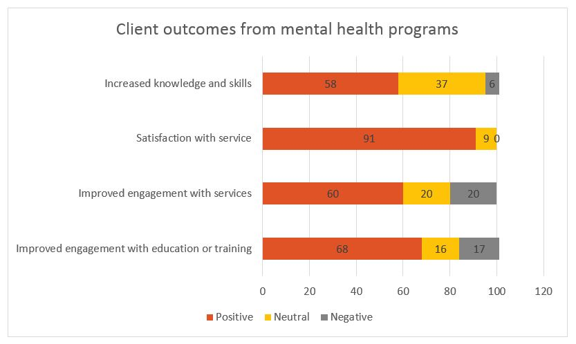
If that same information is broken down and put into separate bar graphs it is easier to see some patterns. In the example below we have taken the outcomes data for one program – the mental health program – and put it in a stacked bar graph.
It’s easy to see straight away that although the service is achieving good results against two of the outcomes it is measuring, several clients are reporting that they are not experiencing better engagement with education and/or training. A quick look back at the data table shows this is true of clients across all its programs. That is valuable information for the service to explore with clients, to include in their planning and to talk to funders about. For example, are local educational institutions and training providers providing adequate support to students with mental health issues, or with disabilities?
Creating charts
All the charts in this How To were made using the wizard in a standard office operating system. Whatever system your organisation uses is sure to have a similar capability.
Also see Microsoft Support – Create a chart from start to finish.
Some final tips
Avoid 3-dimensional charts. Research shows that people find them difficult to read. Two-dimensional charts are clearer.
Avoid Pie charts – they are a popular way to present information but the human eye is not good at detecting the size differences in the slices of the pie. Three dimensional and exploding pie charts (where the slices look like they are being pulled out of the pie) are even harder for the eye to interpret. Rows of pie charts where you are asked to compare the difference in pie slices are the hardest to read of all.
So avoid this:
And avoid this:
Consistency – Choose one kind of graphic and use it consistently through your report as it can be confusing for people to have information presented in different graphical ways. Make sure your graphs also use consistent colours, and that the colours mean the same thing throughout your report. For example orange to represent satisfaction and grey to represent dissatisfaction. And it’s a good idea to make sure your graph has the data entered as numbers as well.
Whatever graphic you choose keep it simple. Try to focus it on one or two simple facts and avoid cluttering it with labels. Explain the most important fact about your graph in your text, avoid having a graph in the middle of your report without explanation of the relevance of the data.